The Most Common Tradeshow Mistake - and How to Avoid It

You’ve invested time, budget, and resources into preparing for a major tradeshow. Your booth is up, your team is ready, and yet - attendees pass by without stopping. Sound familiar?
According to award-winning Canadian exhibit designer Ken Button, the most common (and damaging) mistake brands make at tradeshows is simple: trying to say too much.
“You try to say everything, and you end up saying nothing.” – Ken Button
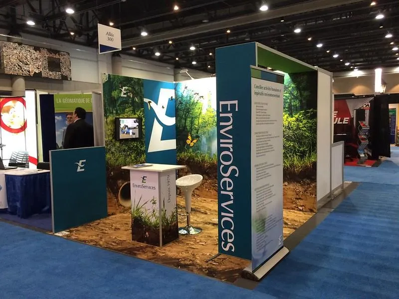
Mistake #1: Overcomplicating Your Tradeshow Booth Design
In an attempt to impress, many companies overload their booths with messaging, features, and visual clutter. This creates confusion, not connection. Ken explains that tradeshow booth design should do the opposite:
Reduce mental noise
Focus attention
Deliver one strong message
Whether you're investing in a trade show exhibition booth design in Vancouver or an experiential agency Toronto-side, cluttered visuals and messaging sabotage impact.
Why Simplicity Is Strategy
Ken advocates for restraint:
Use only one or two key visuals
Keep text short, bold, and legible from a distance
Focus all booth elements around a central goal
This doesn't mean boring. It means effective. A well-designed booth with a clear purpose attracts more visitors than a flashy, overloaded space.
“If a visitor remembers one thing from your booth, what should it be? Start there. Build from that.”
Common Signs Your Booth Is Overdone:
Walls crammed with text and bullet points
Multiple, disconnected brand messages
Cluttered product displays
Visitors unsure where to start
Custom tradeshow banners & displays should guide—not confuse—the attendee journey.
The Solution: Thoughtful Design Hierarchy
Ken’s process starts by determining the booth’s primary objective:
Lead generation?
Product launch?
Brand awareness?
From there, Westkey Xibita structures the booth with zones and layers:
Hero zone: The first impression space
Demo or interaction zone: For deeper engagement
Quiet zone: Private meeting or conversation area
Supporting elements like exhibition display stands, touchscreen stations, and banners are kept purpose-driven, simple, and on-message.
Rethinking Tradeshow Strategy in Canada
Many Canadian businesses - especially those new to trade show displays Canada-wide - believe more equals better. But Ken explains that tradeshow success lies in:
Sharpened focus
Clean presentation
Purposeful interactivity
This is true whether you’re at a regional B2B expo or working with an experiential agency for a brand experience. The design language should be universal, the messaging singular, too much means you dilute the cognitive ability to remember and respond.
The Role of Staff in Simplicity
Even the best tradeshow booth design will fall short if staff are not aligned.
Ken’s recommendations:
Train your team to know and stick to the main message
Avoid jargon and overly technical language
Use conversation starters that align with your core takeaway
“The booth says one thing. The team supports that same thing. That’s when the brand becomes unforgettable.”
Bonus Tip: Stop Thinking in Brochures
Ken warns against treating booths like pages from a catalogue. In his words:
“You’ve got five seconds. You’re not here to explain everything—just to get them to stop, ask a question, and remember you.”
Booth graphics are not meant to educate in full. Their job is to spark curiosity and invite interaction.
Final Thoughts: Less Really Is More
The tradeshow floor is competitive, chaotic, and filled with distractions. If you’re not strategic, your booth gets lost in the noise.
Avoid the mistake of overcommunication. Focus on clarity, creativity, and connection. Let your custom tradeshow display or exhibition display stand speak volumes through simplicity.
Whether you’re showcasing at a massive convention or debuting your brand with a small setup, remember:
Trim the message
Design for engagement
Trust simplicity
And as Ken Button often says:
“When everything’s screaming, the calm voice stands out.”