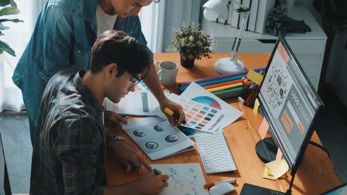
Mastering Print-Ready Graphic Design
Mastering Print-Ready Graphic Design: Tips, Techniques, and Common Pitfalls
Creating print-ready graphic design requires a different approach than designing for digital screens. While digital design prioritizes flexibility and dynamic elements, print demands precision, color accuracy, and high resolution to ensure a professional and polished final product. Whether you're designing brochures, business cards, posters, or large-scale banners, understanding the nuances of print design can make all the difference. Here’s how to get it right.
What Works Well in Print-Ready Design
1. Use High-Resolution Images
Unlike digital designs that can tolerate lower resolutions, print requires high-quality images to avoid pixelation. Ensure all images are at least 300 DPI (dots per inch) for crisp and clear printing.
2. Convert to CMYK Color Mode
Printers use CMYK (Cyan, Magenta, Yellow, Black) inks, whereas digital screens display colors in RGB (Red, Green, Blue) mode. Convert your design to CMYK before finalizing your print file to ensure accurate color reproduction.
3. Set Up Bleeds, Margins, and Safe Zones
Bleed: Extend your design at least 0.125 inches beyond the trim line to prevent unwanted white edges.
Margin/Safe Zone: Keep important text and elements at least 0.25 inches away from the edges to avoid accidental trimming.
Trim Line: The actual size where the final print will be cut. Make sure essential content stays within the safe area.
4. Choose the Right Typography
Use vector-based text (e.g., in Adobe Illustrator or InDesign) for crisp results.
Convert fonts to outlines to prevent font substitution issues.
Stick to legible, print-friendly fonts like Garamond, Helvetica, or Times New Roman.
5. Embed or Outline Fonts
Ensure that all fonts are either embedded in the PDF file or converted to outlines. This prevents printing errors caused by missing fonts.
6. Use Vector Graphics for Logos and Illustrations
Vector files (such as AI, EPS, and SVG) maintain their sharpness at any size, making them ideal for logos and illustrations in print.
What to Avoid in Print-Ready Design
1. Using Low-Resolution Images
Images from the web are often 72 DPI, which is too low for print and results in blurry, pixelated visuals. Always source high-resolution images or use vector graphics where possible.
2. Ignoring Color Conversions
RGB colors may look vibrant on screen but can appear dull or different in print. Always work in CMYK mode from the start to avoid unexpected color shifts.
3. Forgetting About Bleeds and Margins
Neglecting bleeds can result in white edges, while ignoring safe margins may lead to important content being trimmed off.
4. Overusing Thin Lines and Small Text
Fine details can get lost in print. Avoid lines thinner than 0.25 pt and use font sizes no smaller than 6 pt for readability.
5. Not Proofing Before Printing
Always double-check for typos, color inconsistencies, and alignment issues before sending the file to the printer. Printing a test copy helps catch any mistakes before mass production.
Print vs. Digital: Key Differences in Design Approach
Feature
Print Design
Digital Design
Resolution
300 DPI or higher
72 DPI (for screens)
Color Mode
CMYK
RGB
File Formats
PDF, AI, EPS, TIFF
PNG, JPG, GIF, SVG
Typography
Must be outlined or embedded
Web-safe or system fonts
Interactivity
Static, no animations or links
Interactive, supports animation
Techniques to Enhance Print Design
1. Spot Colors for Brand Consistency
For branding materials, use Pantone spot colors to achieve precise color consistency across different printed items. if your print project is intended for commercial offset lithography, including a GRACoL color profile, specifically GRACoL2006_Coated1v2, in your PDF is highly recommended to ensure consistent and accurate color reproduction.
2. Rich Black for Deeper Blacks
Standard black (C:0 M:0 Y:0 K:100) can appear faded in print. Use rich black (C:60 M:40 Y:40 K:100) for a deeper, more vibrant black. While effective for offset lithography, this method is not recommended for digital printing. Consult with your printer for tips on how to apply a rich black to your digital print project.
3. Paper Selection Matters
The type of paper affects how colors and textures appear. Choose between:
Glossy Paper for vibrant, high-contrast prints.
Matte Paper for a softer, sophisticated look.
Uncoated Paper for a natural, textured finish.
4. Properly Export Your Print-Ready File
When saving your final file for print, use these settings:
File format: PDF (Preferred), TIFF, or EPS
Resolution: 300 DPI
Color mode: CMYK
Bleeds included: Yes
Fonts embedded or outlined: Yes
5. Sending a Print-Ready “Package” (Native File Formats Such as Adobe InDesign Illustrator, etc.)
If you intend to send your print ready files in their native file format (e.g. an Adobe InDesign file with links and fonts), remember that legally you cannot simply package a font with a print file and send it to a client or printer. The printer needs their own license for the fonts, either through a subscription or a purchased license. Check with your printer first to make sure they have licensed copies of the fonts you are using in your project. A print-ready PDF with embedded fonts is the preferred method of supplying files.
Conclusion
Effective print-ready graphic design requires careful attention to detail, proper color management, and the right file preparation techniques. By following these best practices and avoiding common pitfalls, you can create high-quality print materials that will provide the visual results you’re looking for. Whether you're designing business cards, brochures, or large-format signage, always test, proof, and prepare your files meticulously to ensure the best results.
Need professional print solutions? Contact Westkey Xibita for expert printing services and high-quality marketing materials!
