Why Simple Design Wins in Wide Format
Simple Design Wins: Why Less is More in Wide Format Printing
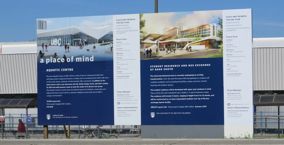
In wide format, I’ve seen clients want to pack in slogans, services, QR codes, and photos - all in one panel. But here’s the reality: no one reads that at 50 km/h. The secret weapon in wide format isn’t more - it’s less.
Story: The Dalmatian in a Hard Hat
One of my favourite hoarding graphics wasn’t a brand wall or logo grid. It was a Dalmatian in a hard hat holding a hammer. The idea came during a construction project where the client wanted something memorable on their site hoarding. Instead of defaulting to a corporate message, we pushed for personality. The result? Passersby laughed, snapped photos, and shared them. The graphic turned a plain construction barrier into a talking point.
Lesson: Humor and personality, when paired with simplicity, can make a brand approachable and memorable.
Story: Banksy’s Influence
Street artists like Banksy know the secret to impact: one bold icon, no clutter. That same principle applies in wide format. A single striking graphic will stop someone in their tracks - something a block of text never will. When I apply this thinking to wraps and hoardings, the results are consistently more engaging.
Lesson: In wide format, inspiration can come from outside traditional design. Borrow from street art’s simplicity and boldness.
Story: Fleet Graphics at Speed
Designing for vehicles requires thinking like a driver. At highway speed, no one has time to read your list of services. But a sharp colour, bold name, and one short message that sticks. I’ve seen clients try to cram phone numbers, websites, taglines, and service lists all on the side of a van. The truth? Drivers won’t process it. Keep it bold, keep it short, and your fleet becomes memorable.
Lesson: Wide format design succeeds when you design for the context in which it will be seen — not just for the proof on a screen.
Practical Tips
Apply the three-second rule: if it’s not understood in 3 seconds, simplify.
Use contrast + white space as tools.
Prioritize one memorable visual/message.
Think in terms of impact, not information.
Final Thought
Simplicity in wide format isn’t laziness, it’s strategy. It’s about designing for how people actually see and remember, not how we wish they did.
