The Complete Designer’s Guide to Color: CMYK, RGB & Pantone Explained
Introduction
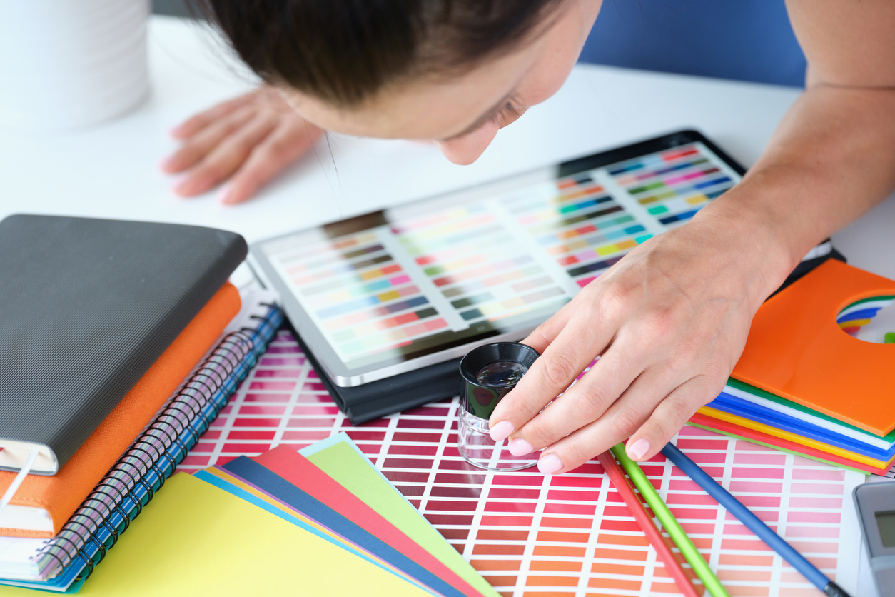
After many years in the industry and so many projects spent proofing and consulting with pantone chips, paper stocks and educating clients - this is the guide I always wished existed. Hopefully this helps someone interested in printing services determine how to nail color for their brand.
Color is one of the most misunderstood parts of graphic design and print production. Even experienced designers are often surprised by how differently color behaves on press versus on screen, and why certain shades - especially intensely saturated reds, oranges, greens, and purples - simply can’t be reproduced using standard CMYK.
This guide is written to demystify color for:
New designers who want to understand the basics
Experienced designers who want deeper technical clarity
Brand managers who need consistent identity across media
Anyone who has ever asked “Why doesn’t this look like it does on my monitor?”
Why It Matters
Color affects:
Brand perception
Packaging results
Marketing effectiveness
Production cost
Customer trust
You don’t need to become a color scientist, but you do need enough understanding to make informed design decisions. This article provides a clear overview of the color landscape:
Why RGB, CMYK, and Pantone exist and why they produce different results
What ink is actually made of
How substrates and finishes change color
Why some colors are simply impossible in CMYK
How color behaves across wide format, digital, label, and offset printing
How Westkey Xibita bridges the gap with tools, technology, and processes
This is your practical, real-world crash course on primary color models.
1. The Landscape of Color: RGB, CMYK & Pantone

RGB: The Light-Based System
RGB is called an additive color model because colors are created by adding light together, not by mixing pigments. RGB is used in screens and digital displays such as TVs, computer monitors, smartphones, and projectors because these devices emit light.
RGB stands for Red, Green, and Blue - the three primary colors of light.
In the additive model, you start with black (no light).
As you add red, green, and and blue light in different intensities, you create other colors.
When all three colors are added at full intensity, they combine to produce white light.
RGB can create neon-like colors, extremely bright reds, saturated violets, and luminous greens that no ink on paper can match.

CMYK: The Ink-Based Process Color System
The CMYK color model stands for Cyan, Magenta, Yellow, and Black (Key). Instead of adding light, CMYK works by subtracting light from white paper. As inks are layered, they absorb certain wavelengths of light, creating different colors. When all inks combine, they produce dark tones (near black). CMYK is:
Flexible (some manipulation can happen to highlight a particular color)
Cost-effective
Ideal for photos and general print
CMYK has a limited color gamut, especially for bright, saturated colors, because its inks are designed to blend consistently rather than produce extreme vibrancy. Despite this limitation, CMYK is the standard color model for most full-color printing, except when using spot colors.

Pantone: The Spot Ink System
The Pantone Color System is a standardized color matching system that assigns unique codes to specific colors, ensuring consistent color reproduction across printing, manufacturing, and design, especially when exact brand colors are required. Pantone inks use:
Purified pigments
Narrow reflectance curves (to get exact colors)
Formulas designed to hit extremely specific wavelengths
These inks can produce colors far outside CMYK’s capabilities, especially:
Fire-engine reds
Bright oranges
Deep purples
Rich blues
Metallics
Neons
The Pantone Color System was created in the 1960s as a way to standardize color so every printer could hit the same shade.
2. What Ink Is Made Of & Why It Matters
CMYK Ink
CMYK inks are made from:
Translucent pigments
Resins/binders
Carriers (water or oil-based)
Their pigments are designed to:
Mix cleanly
Dry rapidly
Work on many substrates
Produce photos, gradients, and screens
They are not designed for maximum purity or intensity (unlike Pantones)
Pantone Spot Color Inks
Pantone inks use:
Higher-purity pigments
Custom pigment combinations
Narrower wavelength reflectance
This creates:
More saturated color
Cleaner hues
Far less wavelength contamination
Expanded gamut areas unreachable by CMYK
Putting it simply: CMYK inks mix to create a broad range of colors, while Pantone inks are precision-tuned for exact, consistent shades.
3. Substrates, Finishes & Processes: How They Change Everything
Why Color Changes on Different Stocks
Ink behaves differently on various paper and label stocks - here’s a quick breakdown:
Coated Gloss Stock
Highest saturation
Sharpest detail
Best CMYK → Pantone approximation
Matte / Satin Stock
Slightly muted colors
Softer edges
Lower color saturation
Uncoated Stock
Ink soaks in
Dot gain increases (eg. definition isn't as sharp)
Colors appear flatter or more "organic" looking.
Films & Synthetics (Labels/Wide Format)
Extremely sharp
Very vibrant
May require white underlay if they are clear or metallic
Soft-Touch, Kraft, Textured Stocks
Excellent for brand mood & tactile experience
Worst for color intensity bc of how they are absorbed
Reds and dark blues become more subdued
This is why design proofs must always consider actual substrate, not just the layout.
4. Why Some Colors Cannot Be Reproduced in CMYK
Let’s use bright, pure red as an example:
To hit a perfect saturated red, you need:
Strong red reflectance
Almost zero blue reflectance
Minimal yellow/wavelength noise
CMYK attempts red using:
Magenta (reflects red + blue)
Yellow (reflects yellow + some green)
This blend:
Leaks blue (cooling the red)
Leaks orange (warming the red)
Can’t isolate a pure red wavelength
Produces a duller, less clean red
Pantone reds use pigments with a narrow reflectance peak, creating a much cleaner and more intense color.
Why adding more CMYK ink won’t help:
More magenta → darker red, not brighter
More yellow → shifts toward orange
Total ink limit → mud, smearing, drying failure
You cannot exceed the pigment physics, so adding more of a particular color actually works against you. Paper can also only hold so much ink so that doesn't work either. CYMK is amazing at creating full color imagery but not known for consistent reproduction of pantones because they contain pigments that are used for different applications. Not to mention there are physical limitations in offset/digital - you can really only tweak the values on a global scale not in a particular square inch to highlight one area over another.
5. Digital vs CMYK on Press: Why Digital Sometimes Performs Better

Contemporary digital presses, such as the Xerox iGen 5 we operate in Burnaby (and comparable equipment in Edmonton), utilize:
Ultra-fine toner particles
Controlled electrostatic placement
Optional 5th color stations (Orange, Green, Blue)
This expanded-gamut setup allows digital to hit Pantone ranges that traditional CMYK offset cannot.
The iGen 5:
Dramatically improves reds, oranges, vivid blues
Reduces wavelength contamination
Provides Pantone approximations closer than sheetfed CMYK
Is ideal for short-run brand materials
Digital doesn’t replace Pantone spot ink, but it can bridge the gap better than standard CMYK.
6. How Westkey Xibita Ensures Color Accuracy
To help designers and brand owners maintain consistent color, we offer several practical tools:
Printed Brand Books
Custom brand books with:
CMYK builds
Digital builds
Pantone swatches
Substrate comparisons
Real-world samples
These are essential for brands who care deeply about consistency.
Hardcopy Press Samples
We provide:
CMYK vs digital vs Pantone comparisons
Label finish comparisons
Wide format samples
Substrate-specific print samples
These help designers visually understand how color behaves across materials.
Press Checks
For mission-critical projects, we encourage clients to attend:
Digital press checks
Offset press checks
Wide format validation sessions
This ensures the final output matches your brand vision.
Xerox iGen 5 Expanded Gamut
Because we run the iGen 5:
Designers get extended gamut capability
Reds, oranges, and blues become far more accurate
We can simulate many Pantone colors without spot inks
Short runs become viable without sacrificing color integrity
This is especially useful for:
Packaging prototypes
Corporate identity kits
Proofing for offset or label production
How Color Behaves Across Printing Processes
Offset printing process (CMYK + Pantone Options)
Best for:
Exact Pantone matching
Metallics, fluorescents, neons
Long runs
Highest ink control
Digital (CMYK and CMYK+)
Best for:
Short runs
Faster turnaround
Expanded gamut with 5th color
Variable data
Consistency
Wide Format (Latex, UV, Solvent)
Best for:
Backlit
Very high vibrancy on films
Label Printing
Substrates + finishes significantly affect color:
Gloss = crisp, sharp, vibrant
Matte = muted
Soft touch = muted but premium
Films = vibrant but may need white underlay
Metallic = unpredictable without blocking layers

Practical Advice for Designers
If brand color matters → choose Pantone or expanded-gamut digital.
If substrate is uncoated → expect softer color.
If printing labels → specify finish early and get feedback.
If using wide format → proof under the lighting environment of final installation.
Always request a hardcopy proof when color is critical.
Final Thoughts
Color is complex, but understanding these fundamentals will transform your confidence in print-based design. Whether you're building a new brand, designing packaging, producing signage, or creating marketing collateral, the more you understand the interplay between inks, pigments, substrates, and processes, the better your work will look, and the more predictable your results will be.
At Westkey Xibita, we love guiding designers through this world. Whether through tours of our Edmonton or Burnaby facilities, printed brand books, or hands-on press checks, we’re here to help you get color right. Please take a plant tour in Edmonton or Burnaby, come over for coffee or call up one of our reps to talk about how we can help make your next brochure, magazine, campaign or custom label project look amazing!