
Top 10 InDesign Tips for Getting Great Files to Your Print Provider
You've spent hours getting your layout exactly right. The images are perfect, the typography is dialed in, the colours match the brand, and everything looks great on screen.
Then you send it to your print provider and get the dreaded email:
“We have a few questions about your file.”
Missing links. Fonts that weren't included. Images that are too low-resolution. No bleed. A dieline that prints. A white ink layer that isn't set up correctly.
The good news is that InDesign gives you some excellent tools for catching these problems before your file ever leaves your computer. Here are 10 practical tips - with specific InDesign instructions - to help you create cleaner, more production-ready files.
1. Set Up Your Document Correctly From the Start
One of the easiest ways to create problems later is to start designing before setting up the document properly.
When creating a new document in InDesign, go to:
File → New → Document
Set your Page Size to the actual finished size of the printed piece. For example, if you're creating a finished 8.5" × 11" brochure, the page should be 8.5" × 11" - not 8.75" × 11.25" to account for bleed.
Bleed is set separately.
Expand the Bleed and Slug section at the bottom of the New Document window and enter the bleed specified by your print provider. 0.125" (1/8") is common for many commercial print jobs, but it isn't universal, so always check the printer's requirements.
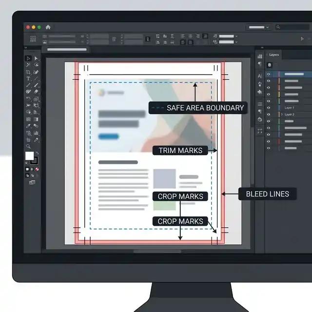
Once the document is created, you should see a red line outside the page boundary. That's your bleed area.
Why it matters
Anything that needs to print right to the edge of the finished piece - background colours, photographs, graphics, etc. - should extend to the bleed line. Your important text and logos, however, should remain safely inside the trim area.
InDesign tip: If you forgot to add bleed when creating the document, go to:
File → Document Setup
You can add or change your bleed settings there.
2. Use InDesign's Preflight Panel Before You Export
One of the most useful - and underused - features in InDesign is Preflight.
Preflight can monitor your document while you're working and alert you to common production problems such as missing fonts, missing links, overset text and certain image-resolution issues.
Go to:
Window → Output → Preflight
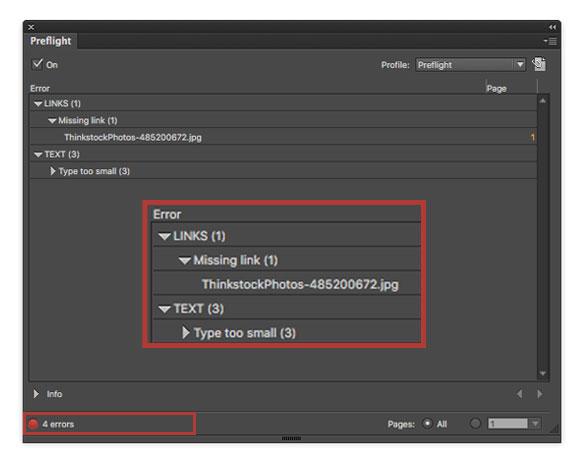
You'll see a green indicator if InDesign isn't detecting problems, or a red indicator if it has found something that needs attention.
Click the indicator to see the details.
You can also create or modify a Preflight profile to check for specific requirements. Click the menu in the Preflight panel and choose Define Profiles.
For example, you can configure checks for:
Missing or modified links
Missing fonts
Overset text
Image resolution
Colour spaces
Spot colours
Bleed and slug settings
Page size
The exact checks you want depend on the type of work you're producing.
Don't wait until export to discover problems. Turn Preflight on while you're designing.
3. Check Your Images Using the Links Panel
InDesign doesn't normally embed your placed photographs and graphics into the document. Instead, it maintains a link to the original file. That's why the Links panel is so important.
Go to:
Window → Links
You'll see every externally linked image or graphic used in your document.
Pay attention to the status icons. A normal link means InDesign can find the original file. A warning or missing-link indicator means something needs attention. If a link is missing, select it in the Links panel and use the Relink option to point InDesign to the correct file.
You can also select an image and view information about it in the Links panel, including its Effective PPI. That's important because an image might technically be 300 PPI in Photoshop but be placed at 200% in InDesign, reducing its effective resolution to 150 PPI.
A useful rule of thumb
For many conventional print jobs, photographic images should be around 300 PPI at their final printed size. However, large-format graphics can have very different requirements because they're often viewed from farther away.
And don't try to fix a poor-quality image simply by changing its resolution from 72 PPI to 300 PPI. If the original file doesn't contain enough detail, InDesign can't create it.
4. Package Your InDesign File Before Sending It
If your printer asks for the native InDesign files, don't simply send the .indd file.
Instead, use:
File → Package
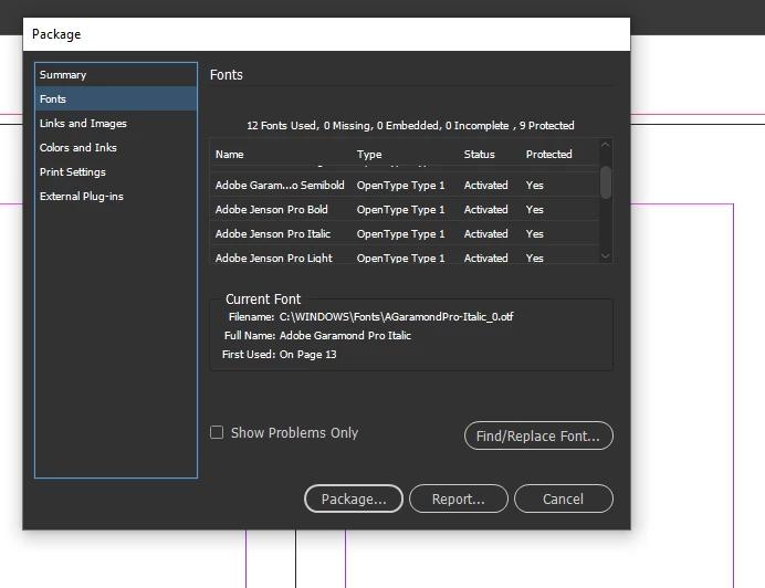
InDesign will check the document and then collect the files needed to reproduce it, including linked graphics and fonts where licensing permits.
The resulting package typically contains:
The InDesign document
Linked images
Fonts
An IDML file
A PDF, if you choose to create one
A report containing document information
This is particularly important if you're moving the project to another computer or sending the working files to a print provider.
One important distinction
If your printer asks for a print-ready PDF, you generally don't need to send the InDesign package as well. The PDF should contain the artwork required for production.
If they specifically request the native InDesign files, however, package the job rather than sending individual files and hoping you remembered everything.
5. Use Spot Colours Correctly for PMS, Dielines and Specialty Inks
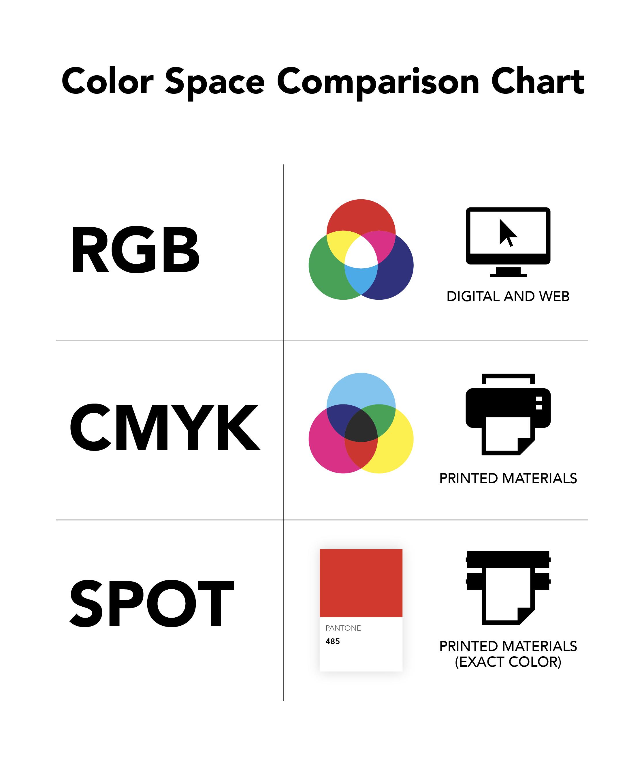
InDesign lets you create two basic types of colour swatches: Process and Spot.
A process colour is separated into the CMYK printing process. A spot colour creates its own separate colour separation.
To create a spot colour, open:
Window → Color → Swatches
Choose New Color Swatch from the panel menu.
In the Swatch Options window, change Color Type from Process to Spot.
This is important when your project uses things such as PMS colours, dielines or specialty inks.
PMS colours
If you're using a Pantone/PMS colour, use the appropriate Pantone library available in your version of InDesign rather than manually creating a CMYK colour and simply naming it “PMS 186.”
The distinction matters because a genuine spot colour tells the production system that this is intended to be a separate ink.
Keep in mind that Pantone library availability has changed in recent versions of Adobe applications, so your printer may provide a preferred workflow for PMS colours.
6. Dielines Should Usually Be a Dedicated Spot Colour
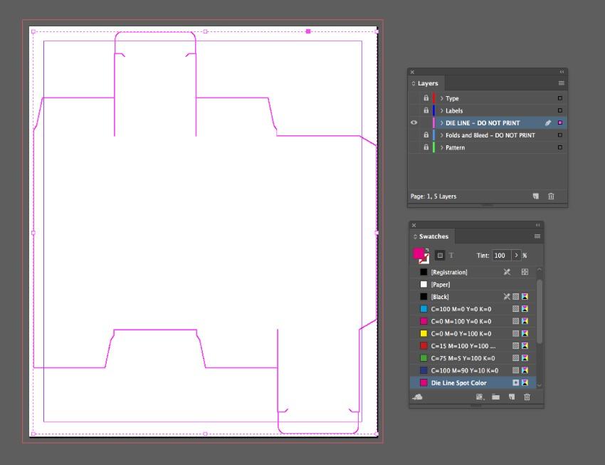
If you're producing custom-shaped labels, packaging, folders, stickers or other die-cut products, your dieline needs to be clearly identified as production information.
A common workflow is to create a dedicated spot-colour swatch named something like:
DIELINE
Then apply that swatch to the dieline path.
Your printer may also require the dieline to be set to Overprint Stroke.
To access this setting, go to:
Window → Output → Attributes
Select the dieline object and enable Overprint Stroke if that's part of your printer's specifications.
But here's the important part:
Don't assume every printer uses the same dieline convention.
Some production workflows use specific spot-colour names, line weights, layers or overprint settings. Others may provide a template with everything already configured.
If your printer gives you a dieline template, use that template rather than rebuilding the dieline yourself.
7. White Ink Requires a Separate Production Layer
White ink is another area where InDesign's normal colour behaviour can be misleading.
In conventional CMYK printing, white generally means no ink. But if you're printing on clear film, transparent material, coloured stock or another specialty substrate, you may need actual white ink.
Your printer may ask you to create a separate spot colour for the white ink, often with a name such as:
White Ink
The white objects may also need to be placed on a dedicated layer and set to Overprint Fill.
You can find the overprint setting here:
Window → Output → Attributes
Select the white object and enable Overprint Fill, if required by your printer.
Why overprinting matters
Imagine you're printing a colourful logo on clear material. If the white layer is intended to sit underneath the CMYK artwork, the production system needs to know that the white should be printed rather than knocked out.
This is a production-specific workflow, though, and the exact requirements can vary between digital presses, wide-format printers and other equipment.
Always get your print provider's white-ink specifications before building the file.
8. Check Transparency and Don't Flatten Everything
Modern InDesign documents can contain transparency, drop shadows, blending modes and other effects. Fortunately, modern PDF workflows are much better at handling transparency than they used to be.
You may hear someone tell you to “flatten your artwork before sending it to print.” That isn't necessarily good advice.
Flattening can combine elements and remove editable information. It can also make future changes more difficult.
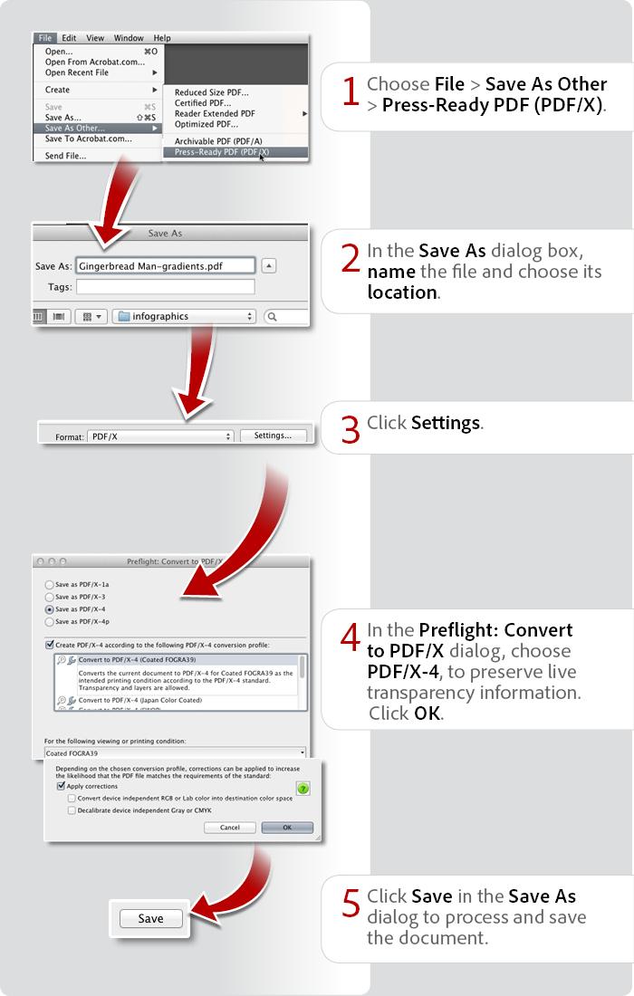
Instead, ask your printer which PDF standard they prefer.
For example, many modern workflows support PDF/X-4, which preserves live transparency. Older workflows may require PDF/X-1a, which uses a different approach to transparency.
So what should you do?
Don't manually flatten your entire InDesign document just because you think a printer wants a “flat” file. Export according to your printer's specifications. If they provide a PDF preset, use it.
Rasterized, vector and flattened are not the same thing.
A photograph is normally raster artwork. A logo can be vector artwork. Flattening refers to combining certain layers, transparency or effects, not simply converting everything into a picture.
9. Be Careful With Fonts
Fonts can cause problems when you're sending native InDesign files, especially if the recipient doesn't have the same fonts installed.
If you're sending the native files, File → Package can collect the fonts used in the document, provided their licensing permits packaging. If you're sending a PDF, fonts should normally be embedded in the PDF.
You can check font usage in InDesign by going to:
Type → Find/Replace Font
This gives you a useful overview of the fonts used throughout the document and can help identify fonts you may have forgotten about.
Don't automatically convert everything to outlines
You may have heard that designers should convert all text to outlines before sending artwork to a printer. That's an old-school solution to a problem that modern PDF workflows generally handle much better.
Embedded fonts preserve the text properly while keeping the PDF searchable and more accessible. Outlining everything also makes editing much more difficult. Unless your printer specifically asks you to outline text, use their recommended PDF workflow instead.
10. Export Your PDF Using the Correct InDesign Settings
Finally, you need to create the file your printer will actually use.
Go to:
File → Export
Choose Adobe PDF (Print) as the format.
This opens the Export Adobe PDF window, where you'll have control over everything from PDF compatibility to compression, marks, bleeds, colour conversion and output settings.
Your print provider may ask for a specific PDF standard, such as PDF/X-1a or PDF/X-4, or they may provide an Adobe PDF preset. If they provide a preset, install it and use it.
If you're setting it up manually
The Marks and Bleeds section is particularly important. If your printer requests crop marks, select them there. Under Bleeds and Slug, select Use Document Bleed Settings so InDesign uses the bleed you established when you created the document.
The Output section controls important colour-management settings, including colour conversion and the destination profile. This is another area where you should follow your printer's specifications rather than choosing a profile at random.
Once the PDF is exported, open the actual PDF and inspect it.
Don't assume that because InDesign looked correct, the exported PDF must be correct.
Check the finished page size, bleed, images, fonts, colours, dielines, white ink layers, transparency and page order. If it's an important project, it's also worth running the final PDF through your printer's preferred preflight or PDF-checking system.
Bonus: Use the Separations Preview to See What Your Printer Will See
Here's a particularly useful InDesign feature that many designers overlook.
Go to:
Window → Output → Separations Preview
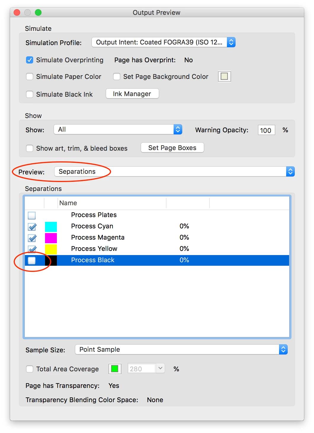
Change the View dropdown to Separations.
You can now see the individual colour separations in your document.
Turn individual separations on and off to inspect what is actually being generated.
This can be extremely useful for checking:
CMYK plates
PMS/spot colours
Dielines
White ink
Unexpected spot colours
Objects that may be overprinting
For example, if you've created a white ink layer, you can turn off the CMYK separations and look specifically at the white separation. If the white objects aren't appearing where you expect them to, you've found a problem before the file reaches production.
This is one of the best ways to understand what is actually happening inside your file rather than relying on how it looks on screen.
Your InDesign Print-Ready Checklist
Before sending your file to the printer, take a final pass through InDesign:
Document
☐ Correct finished page size
☐ Correct bleed
☐ Important content inside the safe area
Images
☐ No missing links
☐ Images are appropriate resolution
☐ Effective PPI has been checked
☐ Images are the correct colour space
Colours
☐ CMYK colours are correct
☐ PMS colours are genuine spot colours where required
☐ Unwanted spot colours have been removed
☐ White ink is correctly configured, if required
Production
☐ Dielines are correctly identified
☐ Overprint settings have been checked
☐ White ink layers have been checked
☐ Separations Preview has been reviewed
☐ Transparency has been handled according to the printer's workflow
Fonts
☐ No missing fonts
☐ Fonts are embedded or packaged as required
☐ Text has not been unnecessarily converted to outlines
☐ Correct PDF preset/standard
☐ Correct bleed
☐ Correct colour settings
☐ Correct marks, if requested
☐ Final PDF has been opened and inspected
Great Files Make Great Printing
Preparing an InDesign file for print doesn't have to be complicated. In fact, once you get into the habit of using a few of InDesign's built-in production tools - Preflight, Links, Package, Separations Preview and the Output panels - you can catch many of the problems that traditionally cause delays and reprints.
The most important thing to remember is that there isn't one universal “print-ready” setting. A file prepared for a digital press may have different requirements from one prepared for a wide-format printer, packaging press or specialty ink application.
That's why the best production workflow starts with a conversation.
Ask your print provider what they need before you start the project. They can tell you what bleed to use, which colour profile to select, whether PMS colours are appropriate, how to construct dielines and white ink layers, what PDF standard they prefer and whether they have a custom InDesign or PDF preset.
A few minutes of preparation can save hours of troubleshooting - and help make sure the piece you designed is the piece that comes off the press.
Have a print project coming up? Talk to Westkey Xibita before you send your artwork. We're happy to help you get the file right the first time.