The Truth About Wide Format Materials
Materials are the reality check of wide format. No matter how great your design is, if you pick the wrong laminate, choose the wrong colours for your environment, or sell unrealistic expectations, the project will fail. Clients need the truth - and we need to be the ones to give it.

Story: Reds Fade Fast
One client wanted bold, bright red as their dominant colour. I warned them about the possibility of fading, but they insisted. Within two summers, the graphics looked pink. Reds are notorious for fading faster than other colours, especially under UV exposure. It’s not about poor printing - it’s science. Being clear upfront saved the relationship, even though the graphics eventually needed replacing.
Lesson: Colours have different lifespans. Be honest about it. As a customer, it pays to do your due diligence.
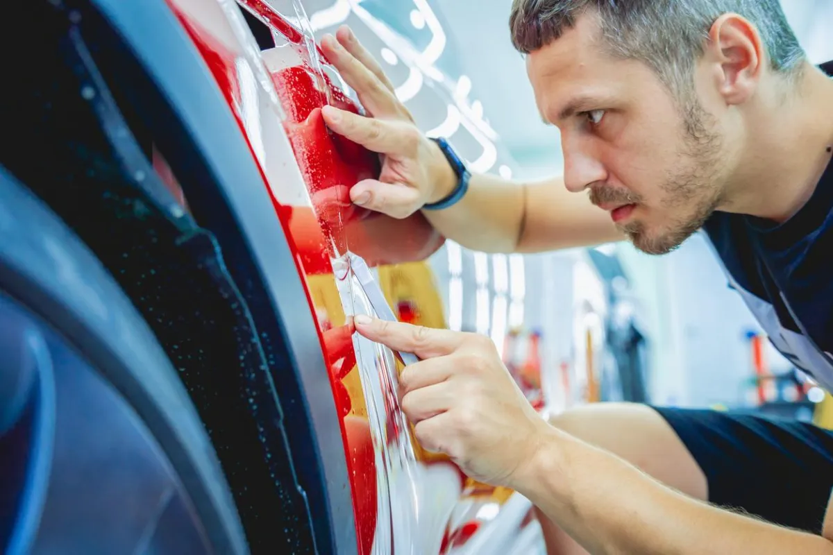
Story: Matte vs. Gloss Laminate
Matte finishes look sleek and upscale, but they mute colours. Gloss, meanwhile, makes designs pop but creates glare under certain lighting. I once had a client choose matte for a retail install. When the final product went up, they were surprised it didn’t look as vibrant as the proof. I reminded them of our earlier conversation, and they admitted they had underestimated the tradeoff. Because I had set expectations, they weren’t upset.
Lesson: Laminates affect not just durability but also appearance. Show samples and explain tradeoffs early. As a customer, take into account the setting you're installing into.

Story: Anti-Graffiti Myths
A municipality client wanted hoarding signage that could resist vandalism. We suggested anti-graffiti laminate, which makes it easy to wipe away spray paint or marker. But I explained: it won’t prevent graffiti - it just makes cleanup easier. They went ahead with it, and when the inevitable graffiti came, they were relieved to find it wiped off easily. Had I promised “graffiti-proof,” it would have been a disaster.
Lesson: Honesty about product limitations builds long-term trust.
Story: Colour Matching a Restaurant Sign
Replacing vandalized signage for a restaurant presented a challenge: no design files, just a faded aqua-blue brand colour. We tested, printed, and re-tested until we nailed the shade. When the new sign went up, the client was thrilled it matched the existing branding perfectly. If we had skipped sampling, it would have looked like a botched repair.
Lesson: Sampling is the most important insurance policy in wide format printing - never make assumptions when it comes to colour-matching.
Practical Tips
Always explain lifespan honestly - no material lasts forever.
Match laminate to the environment - interior vs. exterior matters.
Sampling and precise colour matching avoids disasters - never skip it.
Under promise, over deliver - and you’ll always look good.
Final Thought
Clients don’t lose trust when vinyl fades - they lose trust when you didn’t warn them it would. Being transparent about materials makes you a partner, not just a printer. Every project is an opportunity to educate your client and elevate the end result. At Westkey Xibita, we believe in open communication, sampling, and smart material choices - because the more you know, the better your graphics perform.